


How I Painted This Crazy Thing
for months

A few people asked me how I painted The Uncanny Valley. I took photos along the way, and I’ll tell you as much as I can remember about the process, what inspired it, what worked, and what didn’t.
Interestingly, there is a photograph underneath this painting. I can’t remember what the photograph is.
I printed many photographs on canvas, but a few never sold and sat around taunting me. I finally tired of their insolence, so I sanded and gessoed the canvases. Gesso is a liquid chalk that seals the canvas and makes it smoother to receive fine brush strokes and soft gradients. Girl with a Pearl Earring is on canvas, but it’s smooth like a wood panel. Almost all early oil paintings were done on wood panels, but when good canvas came along, painters could paint large pieces and move them around. You can roll up a dry canvas painting and ship it to be stretched after it arrives. Good stretching techniques and gesso allowed painters to get close to the working characteristics of wood with the convenience of canvas.
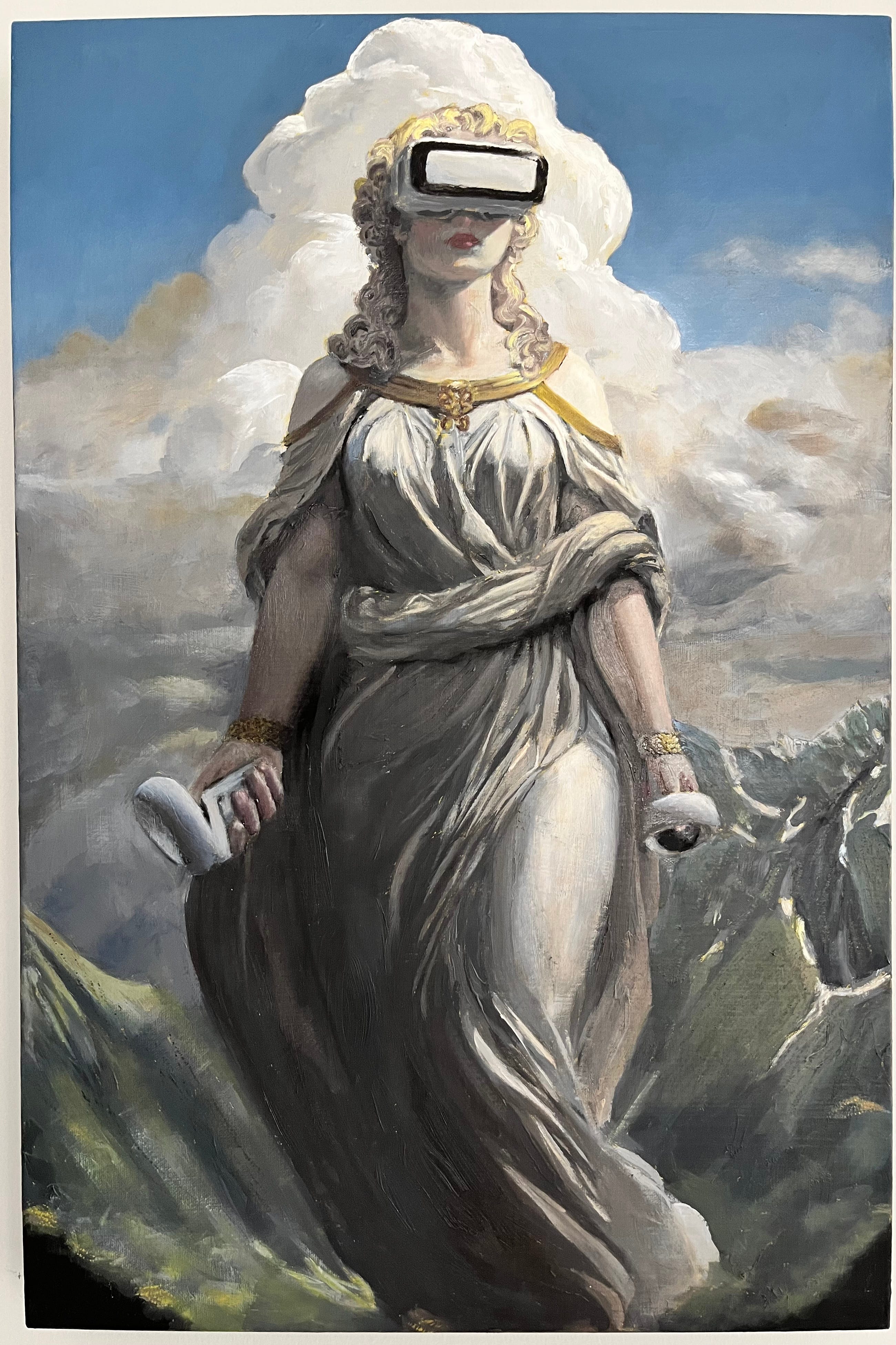
I was thinking one day about Maxfield Parrish, art nouveau, and the iconography of Golden Age illustrators. What would that look like today? I used some generative AI, took some photos, found stock photos, and collaged an image to work from. Overall, I hoped the painting would feel confusingly like AI to someone looking at the painting.


I used Photoshop to ‘posterize’ the image, creating a distinct map of values from black to white. I wanted to start with an old monochrome technique called grisaille, so I mixed nine values from pure black to pure white by mixing a middle gray, then mixing that with black and white, then mixing in between all those shades. I read that Parrish toned his canvases bright yellow to get a little sunlight into everything. I tried that and really loved the results. I let flecks of gold shine through in her hair and jewelry. It also produced a subtle effect in the clouds that stayed through to the finished piece.


I stuck to the value map fairly strictly at first, and then began softening and blending the shades. I spent a couple of months on the grisaille, with the idea that it should be able to stand as the final painting. Honestly, as the black and white version got better, I became reluctant to start putting color on.
However, I stuck with the plan. I let the grisaille layer dry thoroughly, which took a few weeks.
The go-to white for oil painters used to be lead white. It’s a sumptuous, creamy white that mixes well with other colors and dries quickly. It is, true to the label, made with lead. Some oil painters still use it — tradition! I, however, have seen Fiddler On The Roof, and learned that the world changes. Titanium white is the modern choice, but it takes weeks to dry unless you mix it with solvents. I’m also not a big fan of aromatic hydrocarbons. I waited.


Then, I started with very light, tentative washes of color. Everything in the sky and figure is burnt umber and French ultramarine spread very thinly. I mostly use Geneva Fine Art paints, which are handmade in Austin, Texas. I love the hint of umber in her robe and the way the subtle blue and brown create depth in the stormy clouds. Skin tones are wickedly difficult, and I learned a lot during this painting. I gave her some lipstick because, you know, she’s fabulous.
Once I saw a little bit of color, I got over my reluctance. The sky seemed like a great place to start going for it, and that helped me to judge the other colors. There’s a good bit of titanium white in that blue. This painting is on display now, and the sky is still a little tacky. Painting a metallic finish without metallic paint was a fun challenge, too. I put some shadows and highlights in her hair.
Everything you see here is mixed from red, yellow, brown, and white. I only used a black pigment on the grisaille layer (If you’re curious about the exact pigments on my palette, I’ll list them below).


At this point, I wondered what the hell was going on with her right arm. Was it too warm? Too light? Too big? I poked away at little details and looked at that arm. Would I have to scrape it and paint it all over?
It took nearly two weeks of pondering to realize I had shot the photograph of her arm in different lighting. You probably saw that already. I’m a little slow sometimes.
It was a vulnerable moment, realizing that I had to actually paint something from imagination. Until then, I had created images and worked from them directly. The controller in her hand was from the same photo and, therefore, also wrong. The shape of her arm was there, but I would have to create the correct shading. I hoped that once I got the shading right, all the other qualities would also be correct.


Ellen suggested I add some yellow to her hair. I also deepened the shadows in it. I added some texture to the mountains. I darkened some darks and lightened some lights. Every layer is present, including that first layer of bright yellow sunlight in the clouds. Thanks, Maxfield. The thunderhead is mainly from the grisaille layer; I went over the highlights with pure white to make them really shine.
The last thing I did is called ‘oiling out.’ The oil can sink into some of the pigments, making them look matte while other parts of the painting are still glossy. Ivory black is particularly notorious. I took a little linseed oil and an old t-shirt and rubbed it into most of the canvas to even out the shine and texture. I gave it a day to sink in and touched up the places that needed it. Once the painting looked even all over and the oil dried, I applied a thin layer of retouch varnish to protect it during the exhibition. In about a year, I’ll varnish it.
I’m not sure what I’ll do with this painting. Now that it’s on display at Durham Tech, I miss it. We spent a lot of time together. I think I’d sell it for the right price, but that’s a very high price. Maybe I need to paint some more paintings before I can let this one go. Maybe I never will.
I hope you enjoyed seeing the process half as much as I enjoyed doing it. Your fan,
Jonathan Byrd
On my palette for this painting:
1) Ivory black (Gamblin, only in the grisaille layer)
2) Pyrrole rubine (Geneva)
3) Cadmium yellow (Geneva, now replaced with bismuth yellow)
4) French ultramarine (Geneva)
5) Burnt umber (Geneva)
6) Titanium white (Geneva)
Wow! Thanks for the deep dive. In my mid-70’s, I’ve had a convoluted relationship with art making—metal, clay, architecture, sculpture, textiles. I’ve avoided painting for reasons connected to childhood Crayola experiences. However, I just completed a Color Theory class with Lena Wolff. What a cathartic revelation. I’m going to experiment with the six colors in your palette. (That blue…really?!). The alchemy is thrilling. Carry on with your good work, fellow traveler.
Jonathan...you continue to inspire with the depth of your curious and adventurous spirit. Knowing how this remarkable painting came to be is completely fascinating. Thanks for taking us along on your meandering journey...